Everything you need to know about PowerPoint templates

Everything you need to know about PowerPoint templates

PowerPoint templates are the building blocks of a good presentation. Not only do they provide a consistent visual identity, but they also make designing presentations more efficient and effective. In this blog, we dive deep into the world of PowerPoint templates, from their definition to creating and using them, and share valuable tips for getting the most out of this powerful tool.

What is a PowerPoint template?

More than just a pre-designed template, a PowerPoint template is the key to a cohesive presentation experience. A template allows you to define the standard slide layouts, color schemes, fonts and other formatting elements you want to use consistently in your presentations. Whether you are creating a corporate presentation, a sales presentation, an event slideshow or any other presentation, a well-designed template lays the foundation for a compelling and professional presentation.

Benefits of using PowerPoint templates

The benefits of using PowerPoint templates are numerous and compelling. First of all, a PowerPoint template saves you a lot of time. By setting up a template once with the desired formatting and style, you don’t have to keep reinventing the wheel when creating new presentations. This not only makes for a more efficient process, but also ensures a consistent visual identity across all your presentations. Another benefit is the professional look that templates provide. By applying a uniform format, you create a sense of reliability and credibility with your audience. Whether you are presenting to clients, colleagues or stakeholders, a well-designed presentation speaks volumes about your professionalism and commitment to quality.

Time saving and efficiency

Reusing a template saves time that would otherwise be spent formatting each slide individually. This efficiency means that you can spend more time on the content of your presentation instead of the design. This is especially useful in an environment where deadlines are often tight and time is a precious resource.

Consistency and brand identity

A uniform look across all your presentations reinforces your organization’s brand identity. Using the same colors, fonts and logos ensures that your presentations are instantly recognizable and build trust with your audience. This is especially true in larger organizations where multiple people give presentations; a consistent style ensures a professional appearance regardless of who is giving the presentation.

How do you create an effective PowerPoint template?

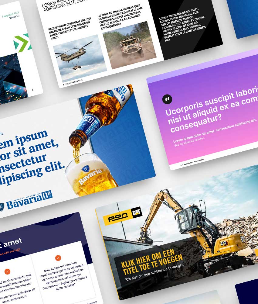
Creating an effective PowerPoint template begins with a thorough understanding of your brand identity. Before you begin designing, it is important to define the colors, fonts and visual elements that fit your brand and the message you want to convey. Then you can get to work creating slide layouts that fit the different types of content you want to present. Think slides for titles, text, images, graphics and more. Be sure to maximize space and maintain a balanced ratio of text to images to hold your audience’s attention. Adding specific elements such as logos, backgrounds and graphics can further personalize your template and set it apart from a standard template. Experiment with different layouts and styles until you create a template that fits your needs and preferences perfectly.
Color schemes and fonts

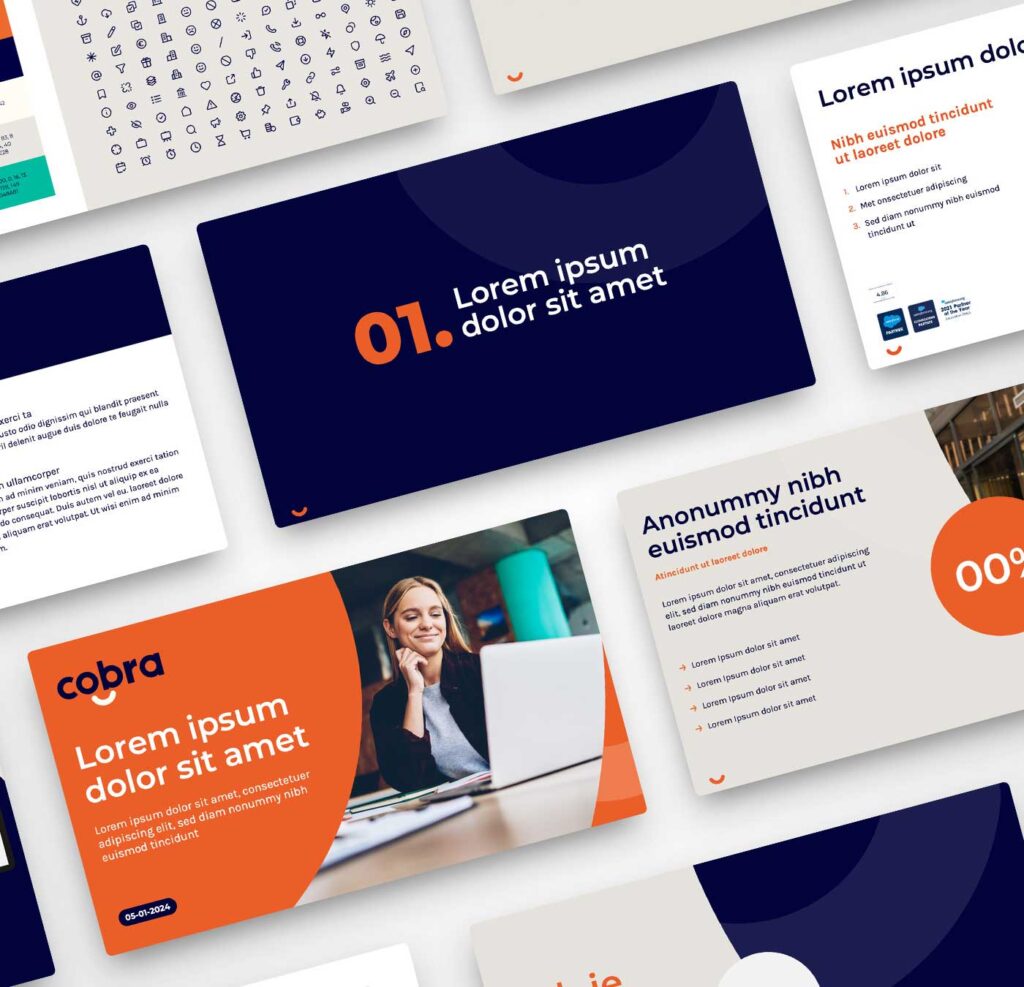
Choosing the right colors and fonts is crucial to an effective template. Colors should not only match your brand, but also evoke the right emotional responses from your audience. Fonts should be readable and fit the tone of your presentation. Using too many different fonts can look cluttered, so keep it simple and consistent.

Structure and layouts

Designing different slide layouts is essential for a flexible template. Consider layouts for title slides, content slides, image and text slides, and graphics slides. Each layout should present content in a clear and visually appealing way. Remember to leave plenty of white space; an overcrowded slide can overwhelm your audience and distract from the message.

Use of graphic elements

Graphic elements such as icons, diagrams and infographics can help visually represent complex information. Make sure these elements fit the style of your template and are used consistently. This helps make your presentation look professional and increases the comprehensibility of your message.

Advanced features and adjustments

In addition to the basics of creating a template, PowerPoint also offers an array of advanced features and customizations to take your presentations to the next level. One of the most powerful tools is the use of multiple masters and themes, which allow you to combine different design styles within a single presentation. For example, using multiple masters allows you to apply different layouts and formatting settings to specific parts of your presentation, such as the title, content and footer. This gives you more flexibility and control over the visual presentation of your information and allows you to create complex presentations with a consistent and professional appearance. Another advanced feature of PowerPoint is the ability to add interactive elements and multimedia to your presentations. Think of animations, hyperlinks, videos and spoken text that can bring your presentation to life and convey your message in a dynamic and engaging way.

Multiple masters and themes

By using multiple masters and themes, you can create a single presentation that represents different departments or projects, each with their own unique style. This is especially useful in large organizations where different teams have different visual identities but still need a unified base.

Advanced features and adjustments

In addition to the basics of creating a template, PowerPoint also offers an array of advanced features and customizations to take your presentations to the next level. One of the most powerful tools is the use of multiple masters and themes, which allow you to combine different design styles within a single presentation. For example, using multiple masters allows you to apply different layouts and formatting settings to specific parts of your presentation, such as the title, content and footer. This gives you more flexibility and control over the visual presentation of your information and allows you to create complex presentations with a consistent and professional appearance. Another advanced feature of PowerPoint is the ability to add interactive elements and multimedia to your presentations. Think of animations, hyperlinks, videos and spoken text that can bring your presentation to life and convey your message in a dynamic and engaging way.

Interactive elements

Adding interactive elements such as buttons, hyperlinks, and videos can make your presentation more dynamic. This is especially useful for presentations shared online, where your audience can navigate the slides independently. These features can also help keep your audience actively engaged during the presentation.

Animations and transitions

Although animations and transitions should be used in moderation to avoid distractions, they can be useful for drawing attention to important points. Subtle animations can help present information in increments, increasing comprehensibility.

Advanced features and adjustments

In addition to the basics of creating a template, PowerPoint also offers an array of advanced features and customizations to take your presentations to the next level. One of the most powerful tools is the use of multiple masters and themes, which allow you to combine different design styles within a single presentation. For example, using multiple masters allows you to apply different layouts and formatting settings to specific parts of your presentation, such as the title, content and footer. This gives you more flexibility and control over the visual presentation of your information and allows you to create complex presentations with a consistent and professional appearance. Another advanced feature of PowerPoint is the ability to add interactive elements and multimedia to your presentations. Think of animations, hyperlinks, videos and spoken text that can bring your presentation to life and convey your message in a dynamic and engaging way.

Tips for using PowerPoint templates

Although PowerPoint templates are a powerful tool for creating presentations, it is important to use them properly to achieve maximum effect.

Keep it simple

Avoid excessive clutter and complexity in your presentations. Keep the layout clean and uncluttered and limit the use of text to the essentials. A simple and clear presentation will make your message come across better and be easier for your audience to follow.

Consistent design

Make sure the formatting of text, images and graphics is consistent across all slides of your presentation. This contributes to the readability and visual cohesion of your presentation. Consistency helps your audience focus on the content rather than being distracted by changing styles.

Save your templates

Save your templates in a central location so you can easily find and use them for future presentations. This saves time and prevents you from having to keep reinventing the wheel when creating new presentations. By maintaining an organized library of templates, you can quickly find the right template for any occasion.

Experiment

Don’t be afraid to experiment with different layouts, colors and styles until you create the perfect template that fits your needs and preferences. Testing different designs can help you discover what works best for your target audience and presentation content.

Visual consistency

One aspect of PowerPoint templates that is often overlooked is the importance of visual consistency. Consistency in colors, fonts and graphics contributes to the recognition of your brand and enhances the impact of your message. When your audience sees consistency in all your presentations, it builds trust and they associate that consistency with professionalism and reliability. An interesting point to add is how visual consistency applies not only to individual presentations, but also to presentations given by different people within the same organization. By using a uniform PowerPoint template across all departments, a company can build a stronger brand identity and communicate a consistent message regardless of who is giving the presentation.

Responsive design

Another crucial consideration when creating PowerPoint templates is the concept of responsive design. With the rise of mobile devices and different screen sizes, it has become essential to design templates that look and perform well on different devices and screen sizes.

Optimization for different devices

Designing a responsive template means taking into account how your presentation will look on different devices, such as laptops, tablets and smartphones. Adding responsive elements to your template, such as optimizing layouts for both desktop and mobile use, can ensure that your presentations will always look professional no matter how they are viewed. This increases the accessibility of your presentations and ensures that your message is delivered effectively regardless of the platform your audience uses.

The importance of accessibility

Another aspect to consider when designing PowerPoint templates is accessibility. It is important to ensure that your templates meet accessibility guidelines so that people with different abilities and needs can easily understand and use your presentations. This can include ensuring color contrast between text and background, using alt text for images and avoiding too many visual distractions. Keeping accessibility in mind when creating your templates will increase the impact of your presentations and ensure that your message is clear to everyone.

Color contrast and readability

Make sure there is sufficient contrast between the text and background colors to increase readability. This is especially important for people with visual impairments. Using large, clear fonts can also help make your presentation more accessible.

Use of alt text and descriptions

Adding alt text to images and graphics ensures that people using screen readers can understand the content of your presentation. Descriptions and text alternatives for multimedia content are also important.

Flexibility in your template

Flexibility is very important when designing effective PowerPoint templates. A template provides a consistent structure for your presentations, but it is also important to leave room for modifications and variations depending on the specific needs of each presentation. This means including different layouts and styles in your template so that presenters have the freedom to customize the presentation to their specific content and audience. By building flexibility into your templates, you increase their usability and make it easier for presenters to create effective and engaging presentations.

Customizable layouts

Offering several customizable layouts within your template allows users to choose slides that best fit the content they want to present. This can range from simple text slides to complex graph and image slides.

Room for personalization

While a template provides structure and consistency, it should also leave room for personalization. This can mean leaving room for unique graphics, company logos or specific content relevant to the presentation.

Keep updating your template regularly

Finally, it is important to regularly evaluate and update your PowerPoint templates to ensure they remain relevant and continue to meet the needs of your audience. For example, updating color schemes, adding new graphics or adjusting layouts based on feedback and changing design trends. Updating your templates regularly will keep you at the forefront of visual presentation and ensure that your presentations stay fresh and engaging. This also demonstrates your commitment to quality and continuous improvement as an organization, which builds trust and credibility with your audience.
Responding to feedback

Collecting feedback from people who use your templates can offer valuable insights for improvements. By acting on this feedback and adjusting your templates accordingly, you ensure that they remain effective and meet your users’ expectations.

Keeping up with trends

Visual trends are constantly changing, and what is considered modern and professional today may appear outdated tomorrow. By staying on top of the latest trends in graphic design and presentation, you can ensure that your templates always look up-to-date.

Conclusion

PowerPoint templates are an essential part of any presentation strategy, whether you are a beginner making your first presentation or a professional who regularly stands in front of large audiences. With the right template in hand, you can effortlessly create professional presentations that impress your audience and get your message across effectively. So what are you waiting for? Get started creating your own PowerPoint templates and discover the power of visual consistency and efficiency for yourself!

Need help developing your template?

At The Presentation Factory, we understand the evolution of presentations. Discover our expertise and let us guide you in harnessing the power of Google Slides for impactful presentations.

Can we help you create a flawless presentation? We have collaborated on numerous presentations and build the perfect PowerPoint, Google Slides or Prezi for you. Contact us!

Share this piece

Learning with laughter: Using humor in presentations

Learning with laughter: Using humor in presentations

Giving a presentation can be stressful. One way to reduce tension and keep the audience enthralled is to use humor in presentations. But you have to find a good balance with the use of humor because sometimes it can turn out wrong. We would like to help you use humor the right way and bring your presentation to life.

Using humor in presentations has many benefits. First, it can reduce the tension and anxiety of public speaking. Laughter reduces muscle tension and reduces the production of stress hormones, making the speaker feel more relaxed and confident. Second, humor can capture and hold the audience’s attention. By using a lighthearted tone and witty remarks, the audience will feel more engaged in the presentation. Finally, humor can make your audience remember the message better. People remember what they have heard better when it is linked to an emotion, such as humor. But be careful!

While there are benefits to using humor in presentations, it is important to be careful with it. Humor can go awry if it is misplaced or inappropriate. Therefore, avoid jokes about sensitive topics such as religion, politics or race. It is also important to know who your audience is and what their background and interests are so that you can use humor that is relevant and appropriate for them.

Tips for using humor in presentations:

  • Start with a funny anecdote or humorous remark to grab the audience’s attention.
  • Avoid negative humor. Instead, use humor that makes people laugh without offending anyone.
  • Keep an eye on the timing. A good joke at the right time can make the presentation more entertaining, but a joke at the wrong time can ruin the presentation.
  • Be authentic. Humor that fits your personality and style will be more natural and effective than humor that feels forced.
With these tips and precautions, you can use humor the right way to entertain and inspire your audience. Learning with laughter is the goal.

Can we help you create an error-free presentation? We have collaborated on numerous presentations and build the perfect PowerPoint, Google Slides or Prezi for you. Contact us!

Can we help you create a flawless presentation? We have collaborated on numerous presentations and build the perfect PowerPoint, Google Slides or Prezi for you. Contact us!

Share this piece

Presentations that do work: avoid these common mistakes

Presentations that do work:
avoid these common mistakes

Giving a successful presentation can be challenging. It is not only important to share interesting and valuable information, but also to have a good presentation style. Unfortunately, many people make the same mistakes when giving presentations, which reduce the impact of the presentation and can bore or distract the audience. We want to help you avoid these common mistakes and give presentations that do work.

1. An overload of information

One of the biggest mistakes people make when giving presentations is overloading their audience with too much information. An overload of information can overwhelm the audience and make the presentation confusing. It is important to focus on the most important information and convey it in a clear and concise manner. Use images and graphics to visually support and clarify information.

2. Lack of preparation

Another common mistake is lack of preparation. Giving a presentation without proper preparation can result in an unclear message, mistakes and interruptions in the presentation. It is important to take enough time to prepare and practice the presentation so that you can get your message across clearly and effectively.

3. Too much text

Text slides are useful for conveying information, but too much text on one slide can make the presentation boring and tiring. Limit the number of words on a slide and use images and diagrams to visually support the information. This will hold the audience’s attention and make the presentation more visually appealing.

4. Lack of interaction

A common mistake is to run the presentation as a monologue. Interaction with the audience is important to keep them engaged and interested. This can be done through questions, discussions and other interactive elements. By creating interaction, you can keep the audience’s attention and engage them in the presentation. If you want to learn more about interactive presentations check out our blog: What is an interactive presentation?

5. Lack of attention to visual elements

Visual elements are an important part of a successful presentation. Using images, graphics, videos and other visual elements can make the presentation more appealing and help make complex information more understandable. Make sure the visual elements are relevant to the message you want to convey and use them in an effective and thoughtful way.

Giving a successful presentation is an art and a skill that can be learned and improved. Avoiding these common mistakes can help you give an effective and engaging presentation. So remember these tips and give presentations that do work!

Can we help you create an error-free presentation? We have collaborated on numerous presentations and build the perfect PowerPoint, Google Slides or Prezi for you. Contact us!

Can we help you create a flawless presentation? We have collaborated on numerous presentations and build the perfect PowerPoint, Google Slides or Prezi for you. Contact us!

Share this piece

The presentation trends of 2023: Keep up and exceed!

The presentation trends of 2023: Keep up and exceed!

The presentation world is constantly evolving and innovating, which is why it’s important to stay abreast of the latest trends and technologies. As presentation experts at The Presentation Factory, we’d like to bring you up to speed on the presentation trends of 2023 that you shouldn’t miss. These trends will help you take your presentations to the next level and captivate and inspire your audience.

1. Interactive presentations

One of the biggest trends of 2023 are interactive presentations. This means that as a presenter, you not only share information, but also engage your audience in the presentation. This can be done through live polling, quizzes, surveys and other interactive elements. By engaging your audience, you create an engaging and memorable presentation that increases your audience’s engagement. If you want to learn more about interactive presentations check out our blog: What is an interactive presentation?

2. Animated videos

Animated videos are becoming increasingly popular in presentations. They offer a visual and creative way to convey complex ideas and information. Animated videos can convey information in a playful and engaging way and appeal to a large audience.

3. Virtual Reality

Virtual Reality is a new trend that is expected to gain a lot of attention in 2023. With VR, presentations can be taken into a whole new dimension. It allows you to give presentations in virtual spaces and the possibilities are endless. VR technology will not only captivate audiences, but it will also provide them with an unforgettable presentation experience.

4. AI-technology

Artificial Intelligence is an emerging technology that has great potential in the presentation world. AI technology can be used to analyze and visualize data, making it easier to convey complex information. With AI, presenters can also improve their presentation skills by receiving real-time feedback on their presentation style and speaking skills.

5. Sustainability

Sustainability is an increasingly important trend in the presentation world. It is not only about minimizing the impact of presentations on the environment, but also about creating presentations that inspire people to live more sustainably. Sustainability can be integrated into presentations by, for example, talking about sustainable initiatives, sharing sustainable solutions and creating presentations that have sustainability as a central theme.

As presentation experts, we believe it is important to stay abreast of the latest trends and technologies in the presentation world. In 2023, interactive presentations, animated videos, virtual reality, AI technology and sustainability are expected to be the major trends. By embracing these trends and integrating them into your presentations, you can captivate and inspire your audience and provide an unforgettable presentation experience. So keep up and exceed with these presentation trends of 2023!

Can we help you create a flawless presentation? We have collaborated on numerous presentations and build the perfect PowerPoint, Google Slides or Prezi for you. Contact us!

Share this piece

Make your presentation memorable with storytelling

Make your presentation memorable with storytelling

If you’ve ever given a presentation, you know how difficult it can be to captivate your audience and keep them engaged.

There are many ways to make your presentation more interesting, but storytelling is perhaps the most effective. Using storytelling in presentations can help you convey your message in an engaging and memorable way. In this blog, we’ll tell you why storytelling is so powerful and how you can use it to take your presentation to the next level.

Storytelling is the art of storytelling and it is one of the most powerful communication tools available. Humans are naturally programmed to understand and remember stories. By telling stories in your presentation, you create an emotional connection with your audience and they are more likely to remember your message.

But how do you use storytelling in your presentation? Here are a few tips:

  1. Start with a strong story. Opening your presentation with a powerful story can grab your audience’s attention and keep them engaged.
  1. Use anecdotes and examples. Tell stories that illustrate your message and use examples to illustrate your points.
  1. Keep it simple. Stories should be easy to understand. Avoid using technical terms and don’t overcomplicate the story.
  1. Use visual aids. Images and illustrations can help support the story and engage your audience.
  1. Make sure you have a good conclusion. A strong ending can strengthen the message of your story and help it be remembered.

By applying these tips to your presentation, you can create a powerful and memorable experience for your audience.

Can we help you create a flawless presentation? We have collaborated on numerous presentations and build the perfect PowerPoint, Google Slides or Prezi for you. Contact us!

Share this piece

7 tips for an unforgettable presentation

7 tips for an unforgettable presentation

We have compiled some tips & tricks to help you give a stunning presentation that will inspire and inform your audience.

1. Be prepared

A good presentation begins with good preparation. Make sure you have enough time to plan and practice your presentation. Start by preparing an outline of what you want to discuss and then create a detailed presentation with slides and visual aids. Practice your presentation several times so that you are familiar with the content and your presentation runs smoothly.

2. Know your audience

Before you begin putting together your presentation, consider your audience. Who is your target audience? What is their level of knowledge about the topic? What are their interests and needs? Customize your presentation so that it is relevant to your audience.

3. Make use of visual tools

Using visual tools can enhance your presentation and keep your audience engaged. Use images, charts, graphs, diagrams and videos to support and enhance your message. Make sure your visual aids are clear and simple and avoid overuse of animations and effects.

4. Use storytelling

A good presentation contains not only facts and figures, but also a story. Tell a story that can inspire your audience. Use anecdotes, examples and personal experiences to tell your story and engage your audience. If you want to learn more about using storytelling, check out our blog on the subject: Make your presentation memorable with storytelling.

5. Be interactive

Involve your audience in your presentation by being interactive. Ask questions, hold a discussion and allow your audience to participate in activities. This creates engagement and keeps your audience’s attention.

6. Keep it short

A good presentation is concise and ´to-the-point´. Avoid long, boring presentations that cause you to lose your audience’s attention. Limit your presentation to the most important information and keep it short and to the point.

7. Be confident

Last but not least, be confident during your presentation. Speak clearly and slowly and make eye contact with your audience. Stand up straight and use gestures to reinforce your point. If you come across as confident, your audience will be more likely to listen to you and take your message seriously. Remember that your audience is there to listen to you and learn from you, so don’t be afraid to show yourself and display your personality. It is your presentation and you are in control of how it is presented. By being confident, your audience will be more likely to remember your presentation.

If you keep these tips & tricks in mind, you will be well on your way to giving a successful presentation that will inspire and inform your audience. Remember, giving a good presentation is a skill that can be developed and improved. Keep practicing and challenging yourself to get better and you will surely be the best presenter you can be!

Can we help you create a flawless presentation? We have collaborated on numerous presentations and build the perfect PowerPoint, Google Slides or Prezi for you. Contact us!
Share this piece

What is an interactive presentation?

What is an interactive presentation?

An interactive PowerPoint presentation contains elements that allow interaction both between the speaker and the audience and between the user and the content of the presentation. Here are some examples of elements you can use for an interactive PowerPoint presentation.

1. Hyperlinks

These are clickable text or images that can lead to other slides or external websites.

2. Buttons

These are interactive elements that you can click on to perform certain actions, such as playing a video, opening a quiz or activating an animation.

3. Video’s and animations

These can be made more interactive by giving choices or asking questions during the video or animation.

Want to know how to add YouTube videos to your PowerPoint presentation? Then check out our tips in the knowledge base.

4. Quizzen and surveys

You can use these to engage your audience and test their knowledge.

5. Interactive images

These are images that can be customized and clicked on to display additional information.

6. Turning knobs and sliders

You can use these to present data or statistics in an interactive way.

7. Timelines and interactive maps

You can use these to present events or locations in an interactive way.

In general, an interactive PowerPoint presentation looks just like a regular PowerPoint presentation, but with interactive elements that make the presentation more engaging and attractive to both the audience and yourself.

Ultimately, the choice of font depends on your personal preference and the objective of the presentation. Take the time to try different fonts and choose one that suits you and reinforces the message of the presentation.

Can we help you create a flawless presentation? We have collaborated on numerous presentations and build the perfect PowerPoint, Google Slides or Prezi for you. Contact us!

Share this piece

How do you choose the right font?

How do you choose the right font?

Choosing the right font for your presentation is an important aspect of the design process because it can contribute to the readability and overall look of your presentation. Here are some tips that can help you choose the right font.

1. Target audience and purpose of presentation

Determine the target audience and purpose of your presentation, it is important to know who will view your presentation and what message you want to convey. For example, if you are giving a business presentation, it is best to choose a professional and readable font, while for a creative presentation you can use a more decorative font.

2. Readability

Keep readability in mind, make sure the font you choose is easy to read. Avoid fonts that are too small or fonts with little contrast between the text and the background. Also, don’t use too many different fonts in one presentation.

3. Style and theme

Choose an appropriate font, choose one that fits the style and theme of your presentation. For example, if you are giving a presentation on technology, you can choose a modern and sleek font, while for a presentation on nature and the environment, it is better to choose an organic and natural font.

4. Context

Consider the context in which your presentation will be given. For example, if your presentation is projected on a large screen, it is best to use a larger font than if the presentation is viewed on a small computer screen.

5. Experiment

Experiment with different fonts, try out different fonts to see which ones work best for your presentation. You can always experiment with different fonts and font sizes to see which works best for your presentation.

Ultimately, the choice of font depends on your personal preference and the objective of the presentation. Take the time to try different fonts and choose one that suits you and reinforces the message of the presentation.

Can we help you create a flawless presentation? We have collaborated on numerous presentations and build the perfect PowerPoint, Google Slides or Prezi for you. Contact us!

Share this piece

The perfect presentation with graphics and color.

The perfect presentation with graphics and color

Before you get started on the design of your presentation, think about what it should roughly look like. The content, of course, is leading. But how you design the presentation with images and colors is also very important. By using a professional presentation to tell your story, potential customers will feel taken seriously.

Images evoke emotion

Super cliché: A picture says more than a thousand words. An image can convey thoughts, ideas or humor that words cannot match. Especially when reinforced with a good story. People can’t read and listen at the same time. By showing the right images with your story, you can create the right feeling with your potential customers. In addition, they will remember your message better reinforced with the right image. Enough reasons to look for the perfect images to accompany your story.

Use the right colors

When designing your presentation, do you look to your company’s colors or do you go crazy? Of course, it remains a subjective topic. After all, does red represent “love and passion” or, on the contrary, “danger and aggression”? Of course, everyone has their own preference and association when it comes to using color. When designing your presentation, you may be tempted to incorporate your personal favorite color. We recommend that you still think carefully about your use of color. It can indeed enhance your presentation. With the right colors, you can give your presentation subtle signals. Think of the yellow McDonald’s M that went from a red to a “healthier” green background. As we mentioned above, what you associate a color with remains personal. Below we list some colors with the “common” associations.

Blue – Represents trust and clarity, reliable, truth, clear, loyal, businesslike and effective. Also, of course, water, air and also tranquility. You often see this color in financial institutions and technology companies and in the central government.

Brown – Nature and weighty, stable. Brown gives your presentation a natural look.

Red – Is the color of passion, warmth, dynamism and power. Red also represents commanding and aggressive. By using this color well, you can really activate people. It gives an energetic aura.

Orange – Positivity and security. In a presentation, it can stand for inspiring, active, warm, stimulation and safety. In Dutch culture, of course, we quickly associate orange with celebration.

Yellow – Happiness, energy and intellect. In addition, yellow also represents creative and light. You should always be careful with yellow in your presentations though, it gives low contrast with many colors. Use it only in design and not for text or use a dark background.

Green – The color of health, nature, harmony, growth, fertility. It is a good color to use for progress.

Purple – Royalty, power, quality and luxury. So a color that exudes quality.

Color scheme

To work well with color, put together a color scheme. Always choose three main colors. If you enter these colors in PowerPoint as theme colors, you will automatically get a row of shades in your color list. This way you can always be sure that colors combine well with each other.

Match color and image

For choosing colors, you can also look at your imagery. Make sure it is coordinated. By using the colors consistently throughout the presentation, you create calmness and a professional look.

Of course, you can also choose to have us look at the colors and imagery in your presentation. In the examples we have given above, you can see what we have done for others in this. We would be happy to work with your presentation as well. Contact us!

Can we help you create a flawless presentation? We have collaborated on numerous presentations and build the perfect PowerPoint, Google Slides or Prezi for you. Contact us!

Share this piece

Relaxed presenting.

Relaxed presenting

Are you faced with the task of presenting yourself? Then of course you want to stand there confidently. Captivate and surprise your audience with an original presentation. Not standard, just different from the rest. There are several ways to stand out. In this blog you can read how to give a presentation in a relaxed and confident manner.

Speaking in front of a room or group of people most people find exciting. There are few people whom it really leaves cold. Whether it is part of your job, you are booked as a speaker or it is the first time you have to give a presentation. Either way, it’s always going to be a bit exciting. Fortunately, there are things that do help take some of the pressure off. We give you 5 tips to present more relaxed.

Prepare well!

No matter how spontaneous, off the cuff and relaxed speakers sometimes come across, count on them to have prepared their story well. So read up well so you know everything about the topic. Don’t memorize a story, but make sure you can retell it in your own words. Practice this by speaking your story out loud. Also think in advance about how you can immediately captivate your audience. Think of a funny anecdote, joke or tell something personal. That way, you’ll make sure everyone is immediately hanging on your every word.

Speak the language of your audience

In your preparation, also think about certain words that are jargon. Can everyone follow your story? Otherwise, think about how you will take care of this in advance. And speaking of language. Who are those to whom you are going to tell it? For example, are they young, old, male, female, religious or learned? It helps to think about this beforehand.

Use current events

Your audience is not waiting for a rehearsed story. Everyone will notice this. But it is nice if you can respond to something that is happening at the time. This creates familiarity and so your audience is more likely to feel addressed. So think about how you can use current events to captivate your audience and create a bridge to your story.

Provide interaction

A trick often used by comedians is to also ask the audience for response. You do this by asking closed questions. For example: Who came by bicycle? Do all the men in the room want to raise their hands? Or make something up. Try to do this with humor. It is always nice to gauge a little bit of what is going on in the room first. By engaging people and getting back to it occasionally in the story, you keep people engaged.

Stand strong with perfect guidance

How does everyone else handle a presentation? What is the expectation of your audience? If you manage to exceed this then of course you are already 1-0 ahead. Is it customary to hand out handouts? If so, put out a blank sheet so your audience can take their own notes. In addition, of course, you have already won half the battle if you present a perfectly designed presentation.

Want to read how to go about this? Then read our blogs below again:

  • “From blank to the perfect PowerPoint presentation”
  • “8 tips for a professional PowerPoint presentation”
  • “How to make a good PowerPoint presentation”

Can we help you create a flawless presentation? We have collaborated on numerous presentations and build the perfect PowerPoint, Google Slides or Prezi for you. Contact us!

Share this piece